cafe; Well the only other thing I found in the map that might be weird, or at least that I’ve never seen before, is something called a characterindirectdetail volume. No idea what that does, but I have never seen one before. Everything else seems pretty standard. Maybe tonight I’ll cook a version without those volumes and see if it changes anything.
Lets nerd it up a bit.
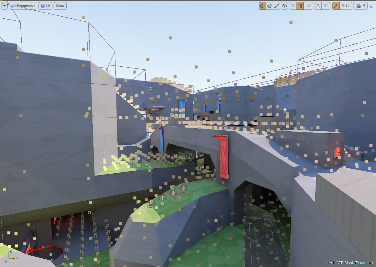
Players are lit using the indirect lighting cache. You get an idea of how this would work simply by looking at the pictures with the samples shown on that page. Found this looking for solutions to player visibility (eg – what if these could be inverted so players are always the opposite of their intended lit value?) but beyond a basic understand of its existence I have no idea how you could modify it. These indirect lighting samples are generated close together at ground level and futher apart above the ground, see the image below for blank. Stands to reason as players in the air will be falling quickly and as such less “precision” required because light changes will be less obvious at speed. r.Cache.DrawLightingSamples 1 in the editor console (~) turns these on.
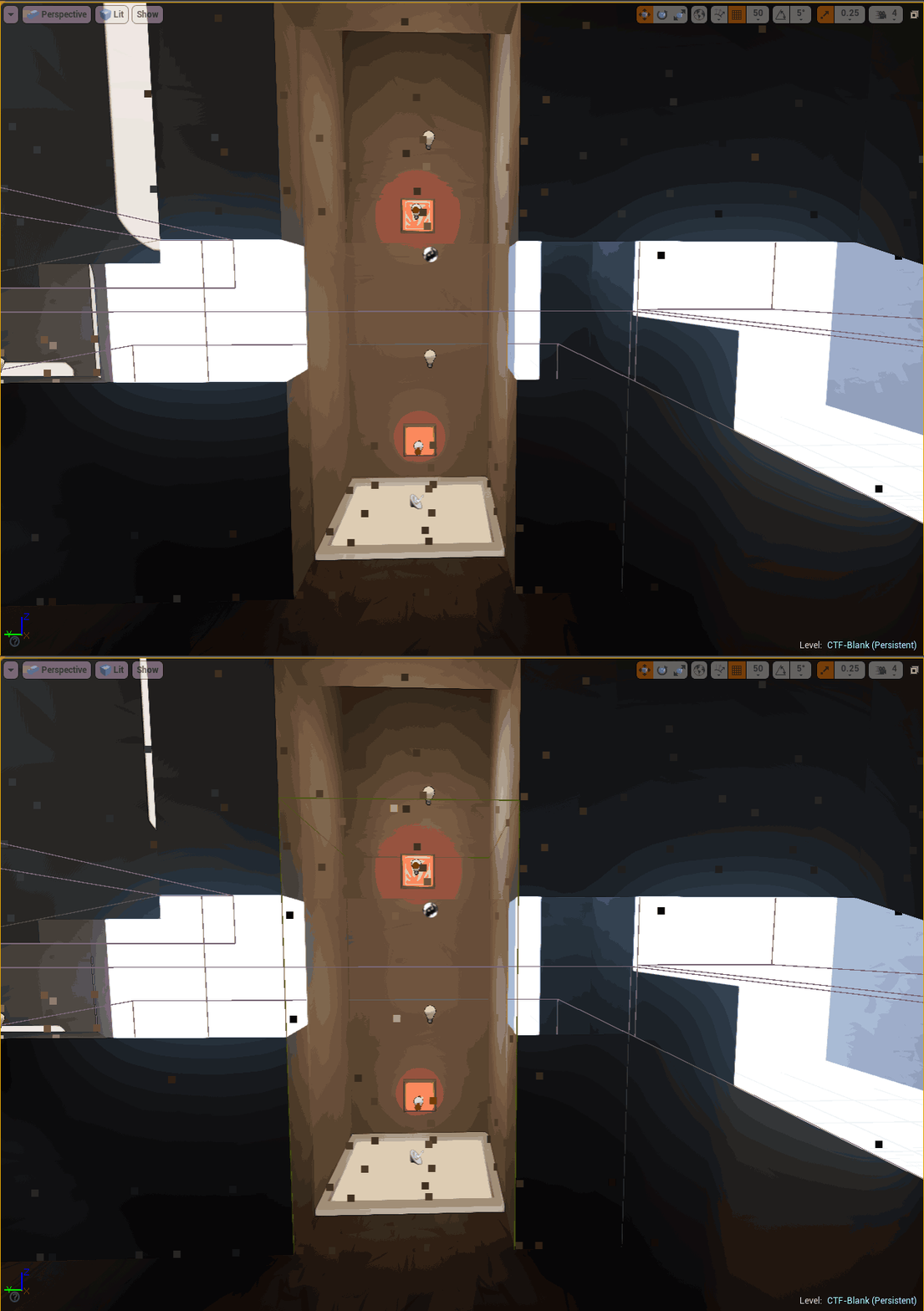
This appears to generates samples above the ground rather than just on the surface. The docs say this would be used in a lift. The assumption here is that the indirect lighting cache generates a sample on the ground, however the vertical granularity is too low for a player moving up slowly on a lift. So if a lift was dark at the bottom but bright at the top the player may end up being “lit” using the dark value from the bottom, as there is no “floor” at the top of the lift for the engine to generate a value from. Epic Docs
The gif below shows how this affects the lift on ctf-blank.
TLDR; You can open epic WIP shell maps and look at how they work as well as copy/paste sections of them.
Download example shell here.
After receiving quite a few queries on “how do lighting” there is evidently a need for a tutorial geared towards newer map makers setting out to create a shell. This article is intended to allow new mappers to quickly push a shell out by doing the heavy lifting for materials/lighting using epics shell setups.
Arguments could be made for learning lighting from shell up and thus building a better foundation of the underlying principles. At the same time some mappers want to make a shell that looks okish and get their ideas played and critiqued. Hopefully this provides a middle ground, giving new mappers a basic understanding of the entities they need to include to get lighting setup, but stealing the base settings from epics shells.
Hopefully this will also serve to improve the base level look on shells, taking that “this is my first map” aesthetics away from some authors first map. Lighting levels are less likely to be a problem using an established baseline (map is too dark/bright), however some fixes for dark areas will be included. This is a side aspect but imo worth looking at as a map textured using the default grid material and lit with a single superbright skylight looks less interesting than something like asdf or the original outside shell.
Firstly use materials from your selected shell on your map. They can be found in \UnrealTournamentEditor\UnrealTournament\Content\RestrictedAssets\Environments\ShellResources\Materials. Glossing over this aspect but may return at some point in the future. Make sure to encase the playing area of your map inside a lightmass importance volume.
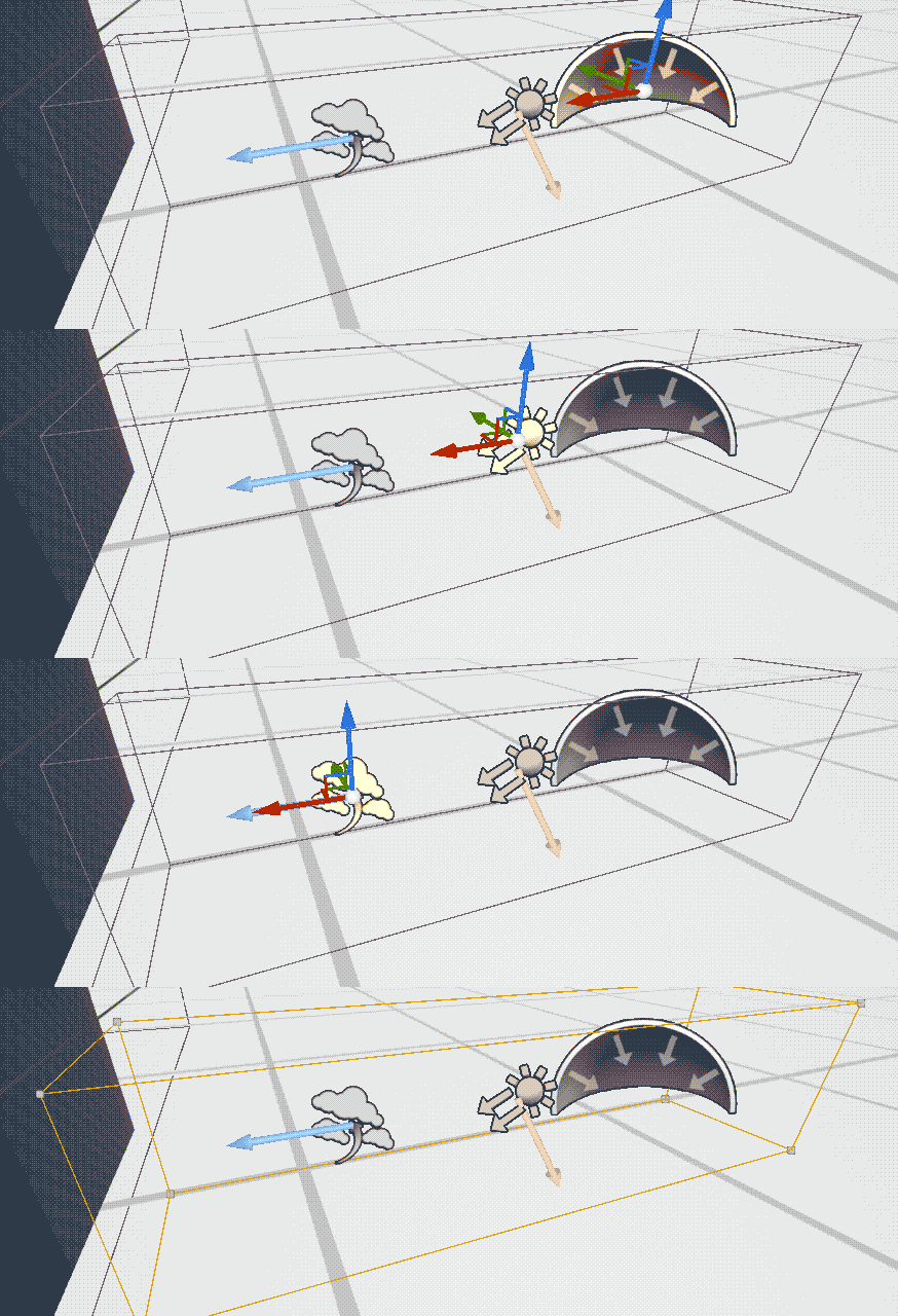
These are the entities you are looking for.
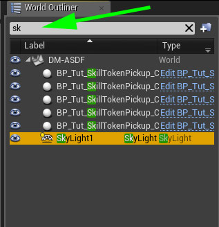
On some maps these ents are handily grouped up for selection, on others you will have to hunt around for them. You can use the world outliner to search for each. To make copying pasting all at once easier you could also move them to the same location. Don’t save the map after changing things.
 Directional Light – Used for the sun/sky light. Epic says : The Directional Light simulates light that is being emitted from a source that is infinitely far away. This means that all shadows cast by this light will be parallel, making this the ideal choice for simulating sunlight. The Directional Light when placed can be set to one of three Mobility settings… Keep reading
 Postprocess Volume – This does all sorts of things, most of them irrelevant outside of copying the actor to get the same look/lighting as the epic shell. Epic says : Unreal Engine provides Post Process Effects to allow artists and designers to tweak the overall look and feel of the scene. Examples of elements and effects include bloom (HDR blooming effect on bright objects), ambient occlusion, and tone mapping… Keep reading
Sidenote : The fortnite double pump shotgun trick is fun.
 Sky – This is a light rather than a sky sphere. Epic says : The Sky Light captures the distant parts of your level (everything further than SkyDistanceThreshold) and applies that to the scene as a light. That means the sky’s appearance and its lighting / reflections will match, even if your sky is coming from atmosphere, or layered clouds on top of a skybox, or distant mountains…
 Atmospheric Fog – Gives us a sky and sun. Sort of. You can add a sky sphere in addition to this, but imo on a shell for gameplay testing purposes it adds little. Epic says : gives an approximation of light scattering through a planetary atmosphere. This can give your outdoor levels a much more realistic look. This total effect includes the following… Keep reading
Copy all of these from whichever shell you are using, open your map and paste. For this example dm-asdf is used. The shells can be found in UnrealTournament\Content\RestrictedAssets\Maps\WIP
What does this do?
After rebuilding lighting we have a lit map. The epic shells rely fairly heavily on the skylight, and for good reason. It looks good and is quite easy to use. So far the only lighting you have is a skylight.
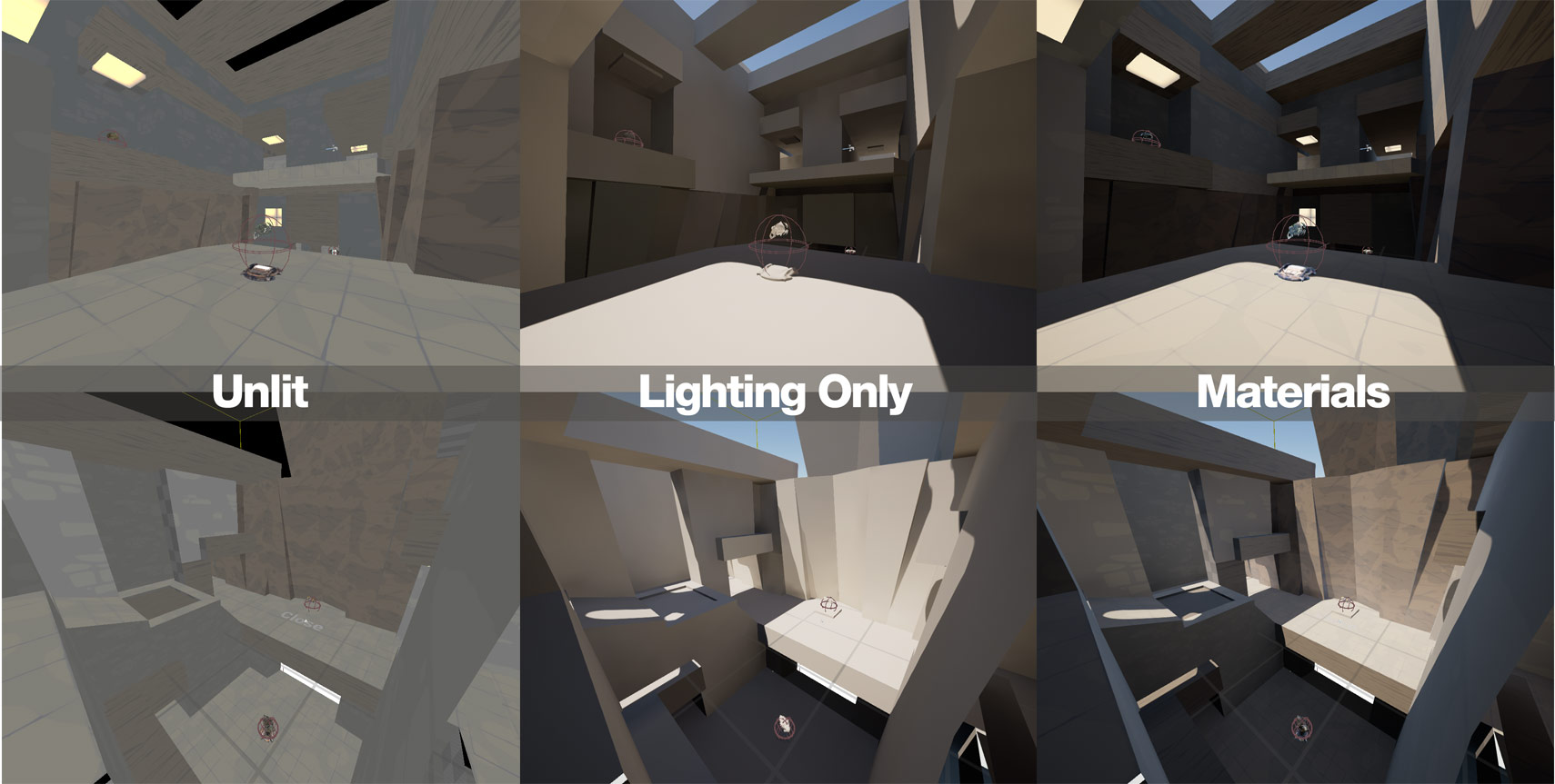
These screenshots are lit using the single DirectionalLight with the settings from dm-asdf. The only entities that have been added are the four listed above. The floor in our sample map uses a material from the Castle ShellResources set. One thing to note is that the lighting setup is tailored to the different shell materials. Taking the ASDF settings and using them with other materials, such as Castle may not have desired results, especially if the material is fairly bright, like the castle flagstones.
Changing this to the same material as the ASDF floor brings the contrast down to a more reasonable level. Take note of the Rotation on the DirectionalLight.
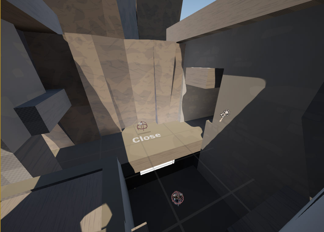
From here the main values we can tweak is the Intensity and the Rotation of the DirectionalLight. Starting with Rotation is good as the light is setup for ASDF and its geometry and may not work well with our sample map. In the screenshot above we can see the floor of the room is quite dark, mainly due to the lights Rotation. Changing to a less aggressive angle can put more light onto the floor. Aiming the light straight down looks unnatural but is an ok starting point for tweaking. Using the rotate widget allows us to give the light a more vertical orientation. 15 degrees is enough. The amount of rotation in the screenshots may not be ideal but it is a starting point for adding additional lighting lower down in the atriums – at least there is now sunlight on the floor of both rooms.
For geometry in the sample map the light could also have been rotated on its Z axis (blue) to be coming from the opposite side of the level. The amount of rotation in the screenshots may not be ideal but it is a starting point for adding additional lighting lower down in the atriums.
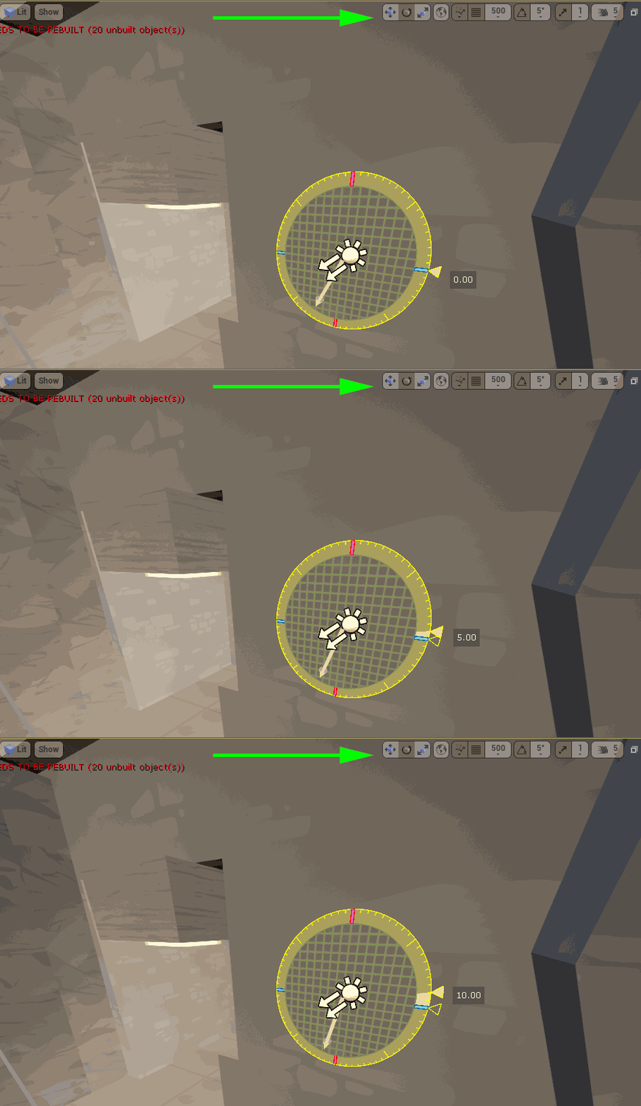
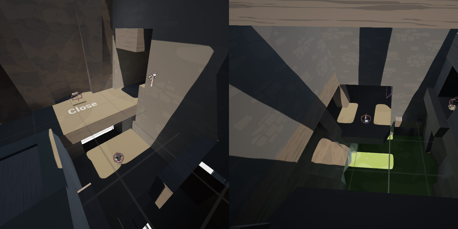
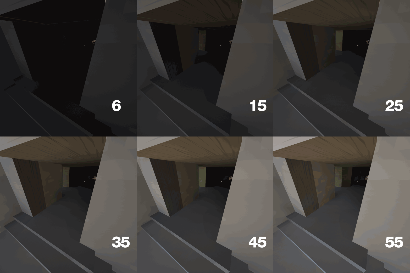
The Intensity is acceptable and for now this need not be changed. This is judged by the areas the light is hitting directly – they are sufficiently bright. If the Intensity is raised further these areas will become too bright/overexposed*. However the “dark” sections are quite dark and contrasty, especially next to the brighter sections. Changing the DirectionalLights Indirect Lighting Intensity is one way to brighten up these areas. Setting this value to 15 lightens up the darker areas a little. This value caps out at 6 if you use the slider but you can manually type in a higher number. Raising this too high can cause odd lighting effects and for very high values a lower intensity needs to be used.
*unsure sure if this is the correct term
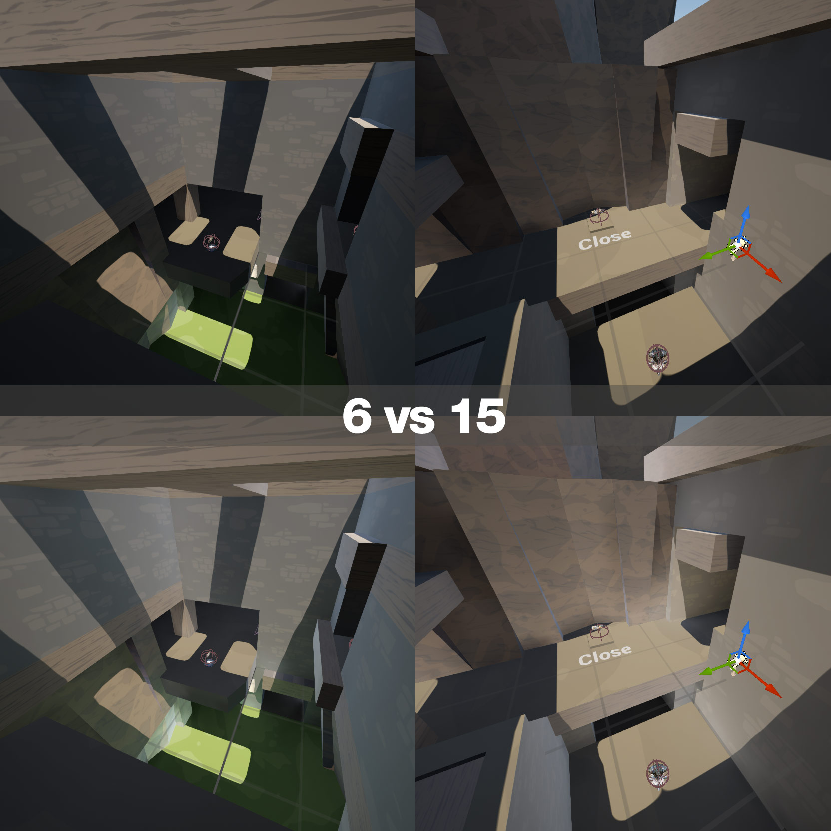
Changing this variable is an interesting way to add subtle fill lighting. The image below is a lower corridor on the sample map (dark with the value of 6 from ASDF) showing how a high Indirect Lighting Intensity on the DirectionalLight effects the scene. Note the subtle shadowing on the floor at the corner on higher values. Hawt.
Basic lighting theory
If you allow the skylight to do the heavy lifting it should be adjusted to a level that gives decent coverage over most of the map from the beginning. It should be the first light you dial in. After this we can add additional lights – in corridors and areas that are closed – as well as fill lights to smooth the lighting in and brighten up darker areas. Tweaking the skylight first is important as adding other lights then tweaking the sky may require you to go back and re-tweak the additional lights. And there may be many.
Stick to lighting with the sky first then adding extras to support it.
Extra Lights
At this point we are done with the initially copied entities.
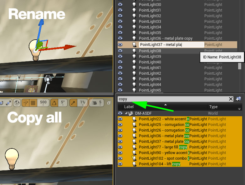
Open dm-asdf and grab some of the lights from the shell. Take quite a few and cull down later if you double up. You can change the name of the entity to keep track of which one is which. Adding a string you can search for later to bring up all the lights you want to copy is also handy at this point.
Copy them all and paste them back into the example map.
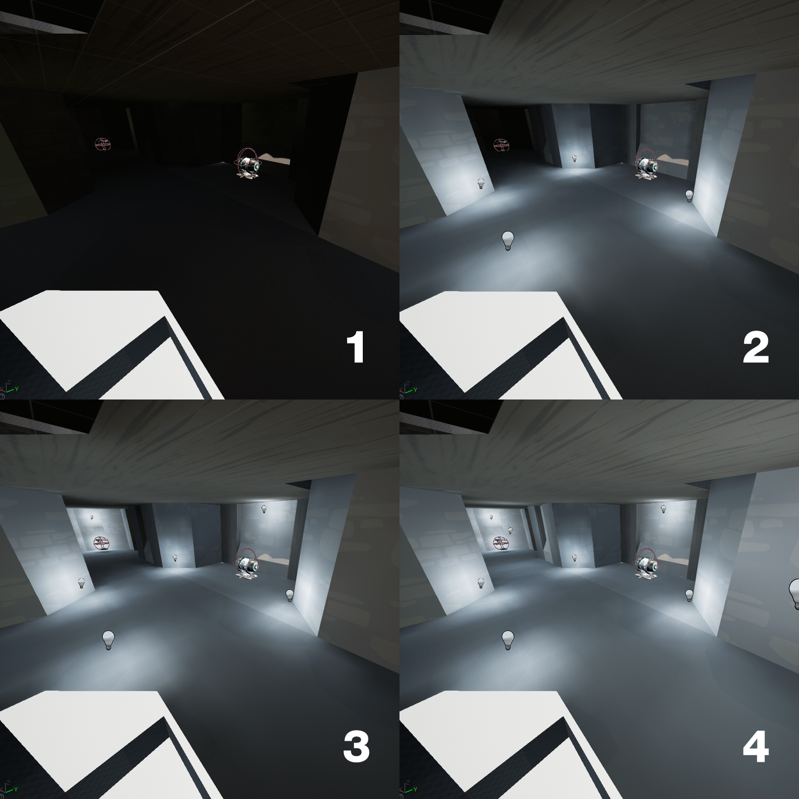
Example 1 – Lower keg area
Taking the lights from the metal corrugation walls on ASDF (eg near helmet) 1) minimal light from the sky penetrates here, what@light leak. 2) one light is added to each corner . This looks ok, the area is lit. 3) Adding two additional lights the same near the mini and one near the keg brighten up the area further. 4) Finally two of the large fill lights from above the belt area on ASDF are added to bring up the dark sections between the corrugation lights. Imagine using a small point light style fixture low to the ground here.
Example 2 – Shard hallway
The map we are lighting is a rough remake of ZTN. I put it together when I first got back into the editor to “relearn” the tools. The shard hallway and upper sections of the map are lit with large flat ceiling lights. We will use the yellowish lights from the lifts on ASDF. One on each ceiling “light”. Done. Looks ok and no additional brightness is needed at this point.
The lights used in the lower keg area have a smaller Attenuation Radius and need additional support from the large, lower intensity fill lights we placed. Because the second set of lights is larger we can skip this step.
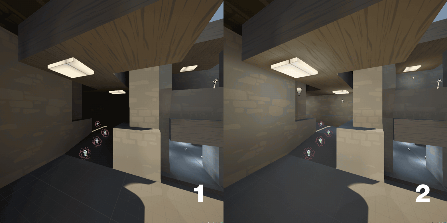
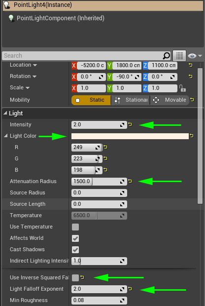
Example 3 – Sunlight fill
We will now step away from the ASDF copied lights to add some fill for the sunlit areas.
To do this we will create large lights with low falloff, allowing them to light large areas with around the same intensity. Because they require no detail they are set to static.
Create a new PointLight and change the following values.
Intensity – 2
Attenuation Radius – 1500
Inverse Square Fall Off – disable
Color : F9DFC600 (same as the sky DirectionalLight)
Light Falloff Exponent : 2
The Intensity is low due to inverse square falloff being disabled. Epic docs on Inverse Square Falloff
Place these on the map where the sun is hitting the ground. They are large, soft, low intensity lights that slightly brighten up and reduce contrast between sun and shade. They are large and no need to be super precise with them. If you get red crosses make sure you changed the new lights to “static”.
Raste;
So ask yourself in every important location: “where am I?” and try to describe it in 4-5 words top. If you can, your location is unique enough, if not then you need to give it more character.
Due to the nature of pickups this is always “flak” “shock” “belt” in arena fps. You can describe areas in 1-2 words. In other game types, perhaps, and in other games players give areas unique names. cs examples of banana, upper dark, lower dark, pit, goose, yet even these can be tied to the bomb site letter – short A, long B. etc – disconnected from any of your four points. Locations become pickup names because they are usually unique. Problems only arise when dm maps have doubled up weapons – in ctf maps doubles are handled via “their flak” vs “our flak”. Depending on the map double up in dm could be handled by high/low or similar. Only when this is not applicable do players need to look for more ways to describe things. The two shocks on temple for example – belt shock and amp shock. Easy. The map decorations will never come into it overall potentially cause confusion.
Take the outpost as an example. I only know the thing in the smelter room is a smelter because someone at epic called it that on a stream in the past. That is “shock room”. Done. If I had never heard someone call it the smelter I would wonder at they at the smelter or the drill – that is not really a drill.. and more a laser?
The pickups are concise, descriptive and for most cases, especially at lower levels are perfectly fine.
Now, having said that there are cases where additional information is required. How would one describe a player coming from rockets to belt on temple via the high route? Hm. This may need a name/descriptor, but this is at a much finer granulation than “what room am I in” scenario most players look at when trying to get their bearing. This level of naming may occur when players play together for competition. “Rockets to belt high” would suffice. Items again, but the relation of two. If there are particular routes that stand out and occur over and over then giving them unique identifiers might be beneficial – but this is going to the level where players do crazy stuff – my rtcw:et team named parts of a particular map after sections of the digestive tract. Nothing to do with the map or geometry.
This is not poo-pooing your four points at all, in fact I agree with them, but I don’t agree that they need to be done just so players can describe where they are – they can do this simply by looking at pickups.
dm-sunder for unreal tournament 4- Duel and small ffa. 2-4 players.
More vertical duddddde. And levels. And connectivty. Yeah!
[B]Load out[/B]
2x Jackets
2x Helmets
2x Rocket Launchers
1x Shock Rifles
1x Flak
1x Pulse
1x Sniper
1x Bio

With a photoshop background masking is cornerstone to how I think about creative stuff in general. With no time to learn 3d/make meshes I will have to rely on epic for most content. However their meshes will not always 100% fit requirements. Masking was the first thing that popped into my head when considering how to use part of a larger mesh, but apparently is not possible. Exporting, modifying, re importing had been suggested, but for some small thing this seems overkill – plus time to learn. No thanks. Here is a quick botch that someone might find useful for tweaking objects to fit what they need.
1. Meet quickly put together wall slide ramp thing using ctf-outside wood plank meshes. Ignoring the misaligned bits, things cutting into each other there are a few problems with the boards straight up.
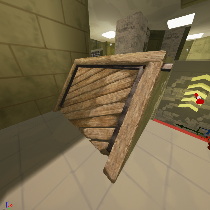
2. Pretend we want to include some “end” joins in the middhle of the ramp, to add a little variation. Also the longest diagonals were not quite long enough. To rectify this it is a simple matter of duplicating the planks, translating them along the existing plank axis and moving the two planks back to where they looked good. This causes some fairly glaring problems, both next to the ramp and also through a wall.
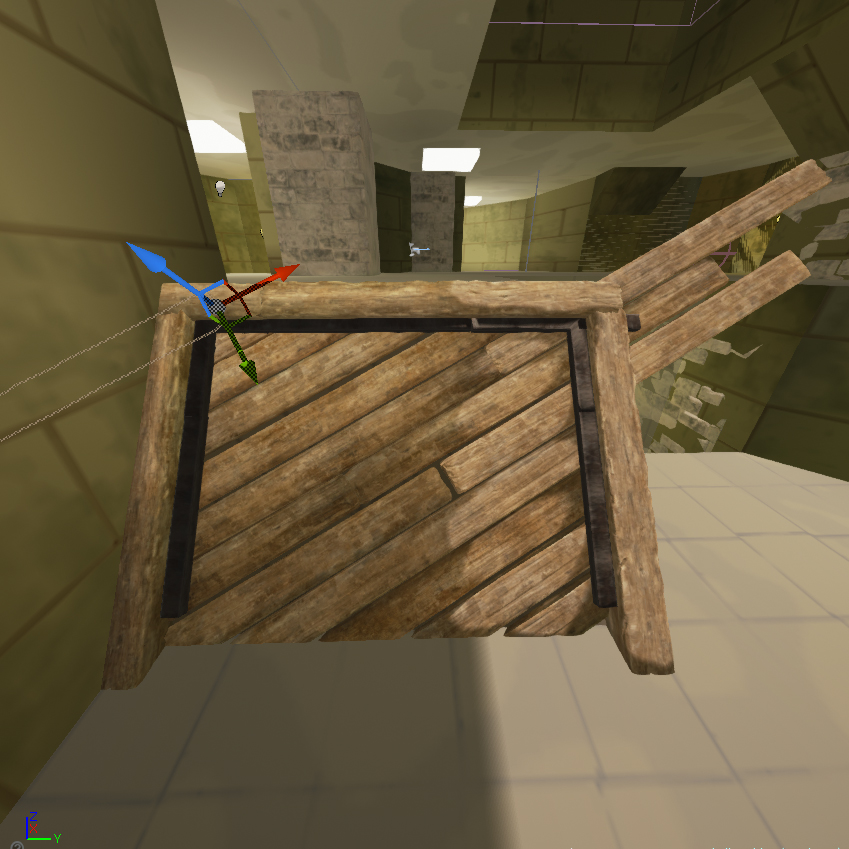
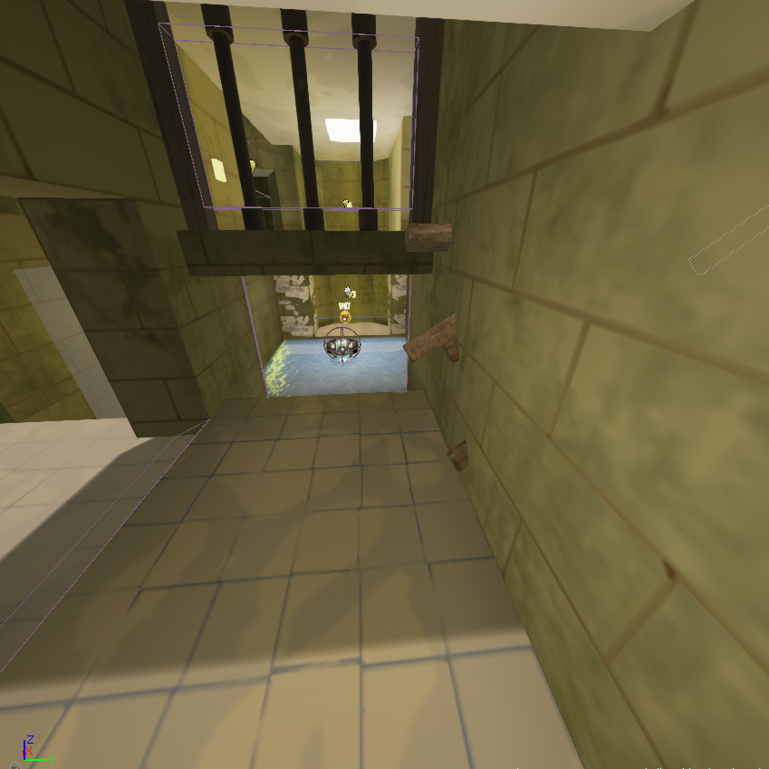
3. If I had created this in photoshop the ends would have been neatly masked off, however this functionality does not exist in ue4. Off to google to find a solution. These are the specific tutorials that helped.
UE4 Vertex paint tutorial, Location based opacity and ue4 vertex paint docs.
For this example only the diffuse was used but you can include normal and other attributes as well. This is well outlined in the videos above. For those that do not want to watch them, duplicate the base colour back from the multiply, change it to normals and connect it up with the vertex colour connected the same way. The material blend mode needs to be set to translucent to gain access to the opacity pin. Using existing epic meshes is easy, find the textures used in the materials and drop those in.
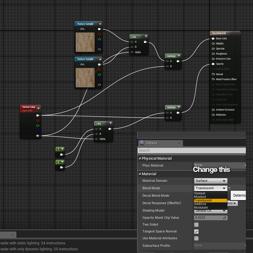
4. Apply this material to the planks then paint in/out sections of the mesh.
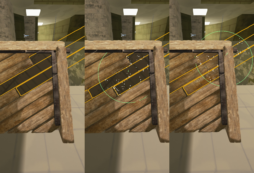
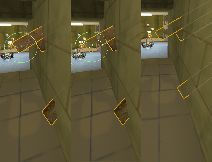
5. Done. Turn off collision for the planks sticking out and create a blocking volume around the ramp. Not 100% sure how it works with shadows so you may want to disable casting on the mesh as well.
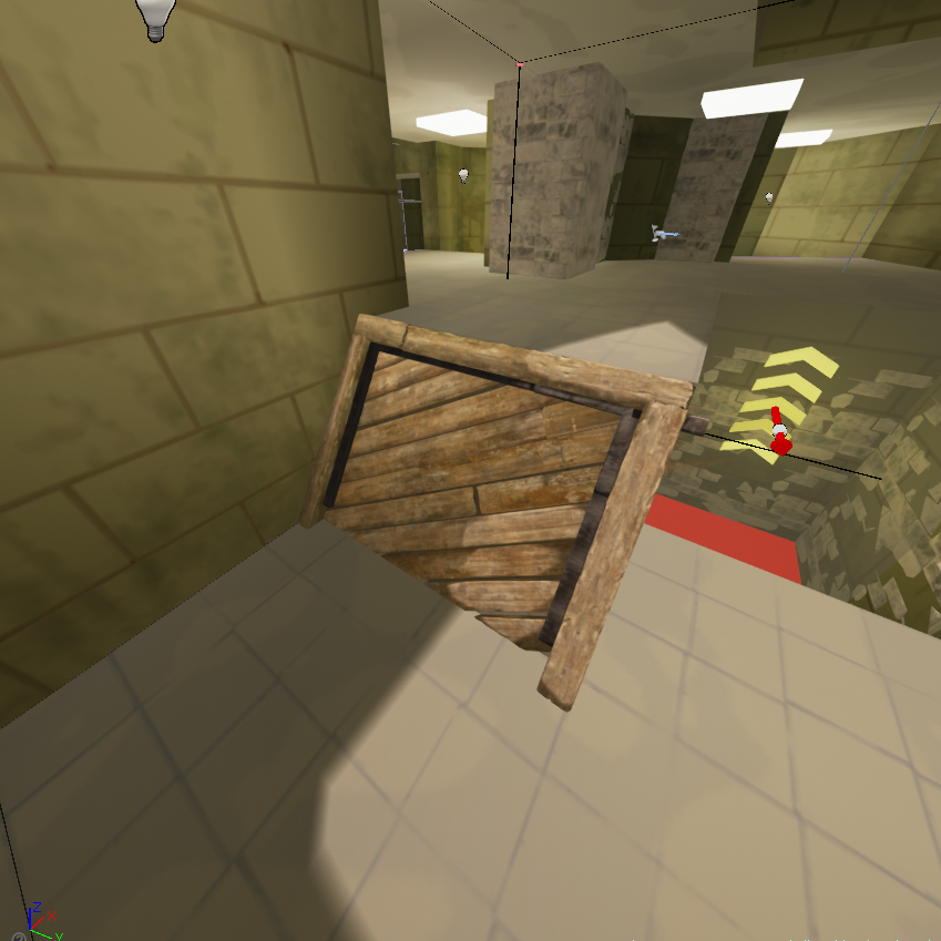
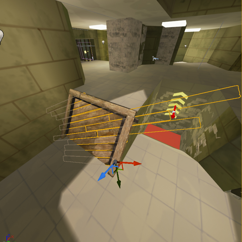
A neater solution using volumes may be possible but is beyond my abilities. If you are interested check this out.
Header image from quakemaps.tumblr.com
If you were inspired by aerowalk you should check out the other quakelive duel maps. All use teles to some degree and overall they use them well. One thing that sets ut and quake apart is the use of vertical travel devices. ut seems to like using stairs/ramps and lifts/bounce pads whereas ql tends to use bouncepads and teles. Take a look at all the major duel maps and you will see there are really only one major vertical rise tackled with stairs on any quake map. Lots of small up/down areas but overall no big stair cases. Keeping in mind most of these maps have large Z height, especially compared to ut.
aerowalk: RA staircase (2 teles – both one way – one very short)
toxicity: LG staircase, however this is flatter than most ql duel maps and I would disregard it (2 teles – both one way – one very short)
ztn: lower YA. This is a lot older and has another “large” staircase at the GL tele. (2 teles – both one way – both vertical – one could be considered short)
t7: Fuckoff massive staircase at mega – however this is rarely used. (3 teles – all one way – all are short – All give vertical travel)
dm13: no staircases that crossed multiple levels, the largest would be at (1 tele – one way – Vertical travel)
sinister: one giant staircase at RA (4 teles – one pair two way – one short)
Cure: One awkward staircase at 50h (2 teles – both one way – both vertical)
t4: zero stairs. (one tele – one way – vertical)
This might seem uninteresting, but is something to look at. Also these maps do not “feel” flat in any way. There is lots of z-axis fighting and the last thing most people would call ql duel maps is flat. Each “section” does not feel flat as there are many small z-height changes via sets of 2-4 steps. t4, an original q3 map does not have stairs like this and feels very flat in comparison. In many ways the way z-axis action is achieved while having mainly flat “levels” is quite interesting.
The “short” teleports typically elevate a player on the Z axis in a single room/atrium. For example the aerowalk tele is about 3 player lengths onto a walkway just above. Sinister is the stand out with its two way tele.
Then going back to look at ut99 maps. The maps listed as “flat” have low Z axis height and as such staircases/ramps do not stand out as much.
Agony – flat (no teles)
Codex – lifts (no teles)
Curse – lifts (no teles)
Deck – ramps (one tele – one way)p
Grinder – ramps (no teles)
Liandri – ramps (four teles – two pair two way)
Malevolence – flat (no teles)
Phobos – this is the most quake-esque ut99 map, excet it has a weird outside section that ruins it for duel. No teles
Tempest – flat
Turbine – ramps
Viridian – flat
ut99 and its successors have veered away from quake style maps. That is fine as the game is different, but it is worth looking at these quake maps and seeing why they work.
diff`lx: I’ve been touting this for a while now. Seemless portals just make much more sense than the classic style portal. It discourages things like piston camping and makes maps much more fun rather than a hide-and-seek match.
Perfect example is Liandri from UT99. The map is otherwise a great 1v1 map but the portals allow for escapes and stalemates that make it too slow and boring. Turn the portals into seemless portals and suddenly belt is not so easy to lock down nor can it be so easily used as an escape.
The OP highlights the problem in this thread – just because a mechanic can be used poorly is not a reason to not include it. The inverse of this is pointing out problems in existing maps and saying they would be fixed by changing to portals.
The way your post is worded reads “liandri should be changed to portals because the teleport mechanic implementation is not very good”. Maps are key to good games and liandri did possibly have an issue with both sets of teleports. Is this a problem of teleports themselves (and thus they must be replaced with portals) or is it simply a problem with the maps implementation that could be solved with other changes, like changing teleport entrances/exits so they are not two way from the exact same spot? Or is the liandri situation one where seemless portals make more sense, which is cool as well.
Both should be available. Teleports exist in other games and are not a huge problem, they generally make maps better when used correctly. If there is a problem with teleports in ut it is their historically lacking implementation of facing upon exit. This should be looked at. If a xonotic style perfect portal cannot be done then a cludgy ut99 style one as an option would be nice. It would take more thought to include and mappers would not be able to use them for major areas, but the ability to add some interest where players leave LOS then reappear elsewhere could be interesting. See fractal and radikus in unreal.
To me the fact that liandri was never changed highlights a bigger problem than teleports. Gamers seem content to play on lackluster maps with lackluster rulesets. I abused that liandri portal in duel many times, not piston camping but two way teleports tend to be a bit of a problem..
For example it took an excessively long time for the dm6 pillar start spawn in quakelive to be removed. Now this is mainly because the creative was in ids hands rather than the communities and even if the opportunity was on the table the community would not have taken it. Or it would have been modified but then not picked up by servers/leagues.Given things like the blanket acceptance of ut99 maps for duel with minimal changes I would guess that it would be unlikely for a change like the dm6 spawn to be community driven.
If the teleports in Liandri were a problem then the map should have been fixed. This isn’t trying to imply the map was good or bad, or that epic suck because they never polished any maps after release, it is more a statement to the general attitude of gamers. We tend to play what we are given and rarely look further than what games ship with. Curse is another example of a map that kind of worked ok, was kept around for historical reasons but the crazy belt/pads pickup split left – beyond this a teleport to the upper room also makes a lot of sense.
Where am I going with this? I’m not really sure. Maps are important but player acceptance of maps that are obviously lacking plays a big role in shaping the game. It would be nice if there was some sort of push mechanism from a central repository so authors can update after the community has played their creations for a while. Testing only shows up so many problems – things like pillars spawn on dm6 or YA spawn on aero and some other average spawn pairs in quakelive can take a long time to show up, and even if play testers get them in testing they may not necessarily put two and two together and point it out.
Many years ago, game level creators were both designers & artists.
Really? I have followed thirdparty level design on an off in quake and unreal since ’97 and very few mappers created textures, about the extent of “art” back then. Making levels look “nice” was fairly straight forward. Take textures and create some architecture that is modular-ish using these. Wall panels, supports, lights, trim, floors, etc. This ends up being on a power of two grid – with quake the minimum used was 16 from memory due to stair height. When mappers around here talk about “keeping it on the grid” this is what I think of – not making sure it is snapped to a single unit grid, which is quite often what they mean.
This is essentially what you are spruiking, but using meshes instead of textures and brushes. Good level design has always been like this and bad level design looked shoddy in comparison. But it was not art. By ‘99 this should have been simple and should have slapped anyone interested in level design in the face. The problem is many maps were not released this way and as a general rule they looked terrible as a result.
If level designers used a similar methodology blockouts would go a lot smoother.
At some point, game studios started to split the job into multiple jobs and now we have level designers and environment artists. Essentially these days… level designers create a blockout, test gameplay for two weeks, then artists arrive, they break down the level to create modular assets, they’ll change some areas of the map to fit the art, they’ll create unique assets to fit the blockout, etc. However, when it comes to the creation of game levels, the art is the bottleneck and there are many issues with the method that I just described. Designers waste a lot of time testing the gameplay when some areas will change anyway when artist will touch the map. Artists waste tremendous amount of time trying to break down the map. Artist will have to create more meshes than they should to fit the custom blockout, etc. The workflow that Hourences uses is a lot more efficient. He creates the modular meshes first and then build the level with those. Right from the start, that means that he doesn’t create a blockout and waste his time trying to adjust the gameplay when it will change later anyway. Because he uses meshes to build the level, he doesn’t have to break down a blockout into modular meshes, etc. He basically works at least 2-3 times faster than usual, plain and simple. And because most level designers these days aren’t also 3D artist, the quality of their map layouts often take a hit.
This sounds like web design ~8-10 years ago. You could contact a designer (level designer), get a layout slapped together in photoshop then have it converted to a page (primarily HTML/CSS) by a developer*(environment artist). Depending on the layout this could be a nightmare for the developer. The argument was that a good developer could make anything work, but unless the designer was aware of the pages restrictions it could be challenging and time consuming to do so. Of course there would be overlap, designers that knew limitations of the medium they were designing for and even designers that could put the final product together. The thing to keep in mind here is that the designers that knew how to put the final product together also generally easier to build as they were aware of these limitations.
While I do not work in the games industry it seems that you want modular assets created then levels made from that point? Essentially what Hources talks about in one of his videos (22minutes) – making 600 meshs that should cover most common uses. Then using these lego pieces to create maps. These meshes are standard sizes giving enough choice, but translate easily into some sort of blocking out methodology, be it BSP or something else?
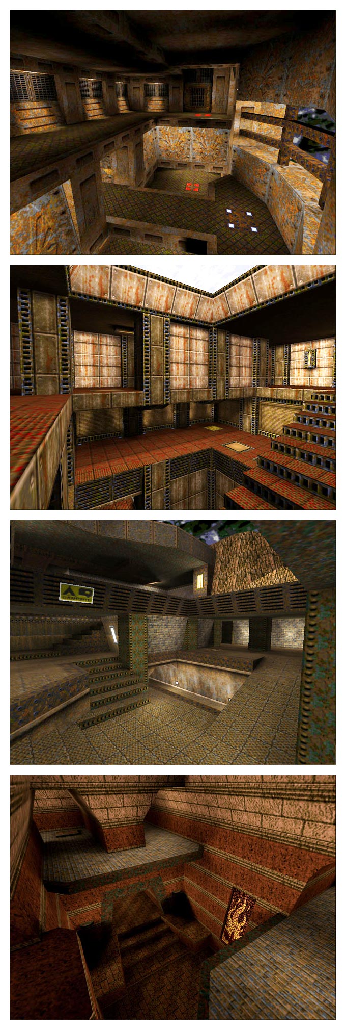
In an ideal world where we have level designers and environment artists and it would make sense for both parties to have at least partial understanding of the both work flows. Using the quake screenshots quake you can clearly see how different assets would be created for these bits of architecture.
Level designers ignoring this and going full 13, 29, 42, 87, 429 units is dumb. Outside of a few edge cases like stairs and narrow openings (which could be a “standard” size anyway) I fail to see the reason to do it.
Your gripes with the industry sound like a mix between two groups that do not communicate, two groups that do not understand each other or deliberately go out of their way to make things difficult for each other. Or even a group that has forgotten its roots (level designers) and just make things 100% free form. How is that ever going to work?
In the past maps that did not follow some sort of style similar to the quake examples tended to be bad.
*Not sure this is really the correct term for the simplistic example but it should do to illustrate the example.
Duel/small FFA (3-4player) map
If this map continues the below will update.
Preface
This map is a intended to be a departure from more recent ut duel map trends in the unreal universe. It is an attempt to create a map that plays in a similar way to the original ut popular duel maps while “fixing” some of the potential problems those maps had. Codex. Curse. Turbine. Grinder. Agony. Tempest and so on. These have always been popular maps and two names pop up reliably when discussing “best” dm maps from ut99 or the ut series in general. No delusions here, my map will never be that quality but the hope is to produce something decent.
This is where ut duel was born and more importantly this is where the ut ruleset originated. Sadly the game never stuck with this style of map, moving towards a more aerowalk/roughinery layout in general as time went by.
The map is an attempt to combine the ut99 style with some interesting quake aspects, primarily the lack of vertical travel via large stairs/ramps – instead shifting the vertical component to bounce pads, teleports and because this is ut, lifts.
Cut offs that feel deliberate are awesome and landing damage on enemy players is satisfying. This is a big part of what the teleports, jump pads and the map in general is aiming for.
Finally maps with one location of control like ASDF as sad. dm-twentyseven is quite small and fairly open, however LOS restrictions, along with movement options (rather restrictions) it will play larger than it feels, at least that is the plan.
Audio
ut4 audio is bad, Epic are aware of this and have it in the pipeline for fixing. The map features added a set of audio queues to the map using the foliage footstep sounds. These are placed where setting them off results in potentially faster movement, thus trade offs for the player to consider. Fast – noise, slower – quiet. Originally these were graphically an ivy mesh from the outside set, however the current build does not have the asset required and they have been changed to green blobs. Rustle at your peril.
Concerns
The map has some fairly long los areas. Pillars and other additions are primarily there to limit these. The stand out that may be problematic is from the red tele exit through the center hall way. Not sure if this is too far.
Basically anything to do with the item load out and how it plays. To my knowledge no dm maps, and especially no duel maps have strayed from belt/jacket/pads and when they do it is via omission rather than extras or double ups.
I get horrible performance compared to epics shells.
Map load out
This is an attempt to use the ut item set to improve duel.
2x Jackets
1x Thighpads
1x Keg(+50, 40 second spawn)*
2x Rocket Launchers (2 ammo)
2x Shock Rifles (2 ammo)
1x Pulse (1 ammo)
1x Sniper
1x Bio (2 ammo)
*This might be controversial but it is included to clash frequently with the 30 second items.
Two jackets and short keg is intended to tie up the in control players time. With weapon pairs the same is intended – to deny shock or rockets requires two pickups. The lack of ammo is also intended to push players to control both weapons if they want to use more frequently.
https://ut.rushbase.net/joel/DM-twentyseven150619a.rar
Known issues/bugs
The three vial center connection has invisible snags in the air. This was sort of there in editor but worse after pakking the map.
Some stairs unclipped.
Some clipped stairs still snag.
Known issues/bugs
The three vial center connection has invisible snags in the air.
Some stairs unclipped.
Some clipped stairs still snag.
No bot support
Neohuman: I believe duels in UT99 never used the belt. I never remember having either of those available when playing on the main duel servers or with the old “pros” and this is what Ut2k3/2k4 was based off. Interestingly ASDF seems to be designed around a polarity between the belt and the chest piece, and I think it’s done well. Still I agree with you that the belt is overly important, but at this point rather than removing it I may still lean towards making players spawn with some armor. I’m not too sure which I prefer, deck with belt or deck without. Here
ut99 was generally played with amp/invis/keg* disabled. Referred to at the time as “EU rules”. Generally weaponstay was off but I do recall watching some old German demos of horny playing with WS on.
*not on any duel maps, let alone dm maps in general.
US/AU/NZ* played with the default “remove powerups” mutator. AU/NZ changed mid 2000 and played with EU rules. So much better. Bit more trivia – wcg2001 (first wcg) announced rules in line with EU ruleset (plus a retarded map list that included maps never played like peak and koos). This generated all sorts of fun discussions because NA played without belt. A few weeks before the event (after qualifiers had been run with this ruleset) the organisers backflipped and changed to NA rules. Oh the shitstorm that resulted was amazing.
*Probably others too. But the majority played with EU rules.
ut99 map list around 2001:
Agony
Codex
Curse
Deck
Grinder
Liandri
Malevolence
Phobos
Tempest
Turbine
Viridian
This is not all encompassing and I have probably missed some, but overall at some point between release and 2003 when ut2k3 was released these were played fairly heavily compared to the rest of the DM maps.
The belt is not overly important. The “amount” of armor any of the items give is fairly irrelevant in and of itself. The problem, if you want to call it a problem, is the disparity between in/out of control play.
I guess you could say that the belt is “too much” but this is only because when the in control player has belt+jacket under control (not difficult given their spawns) and the out of control player is working with thigh pads only. So rather than nerfing belt, because really big armor is required for big hitting weapons, give the out of control player options for equalising stack
Of course other maps were played but these were the “better” ones. The duel map pool so to speak. I say better and not awesome because I don’t really think any of them were that great. Epic were very clever with their design and all of ut99 worked kind of ok. Most of the maps were large and balanced oddly for duel. For instance curse had belt vs thighpads. Tempest was a gigantic +back affair due to its size and while not directly related to items this is an illustration of problems that existed. All the maps could have used tweaking – things like addition of jacket (curse), addition of belt (malevolence) and so on. Size wise these maps were ok, with the outliers (tempest/viridian) being a bit large/small. Connectivity wise they were ok with some oddness like the upstairs sections of curse and codex being super campy and difficult to access.
And as a community we could have fixed the maps. Since we could edit the maps it would have been fine to fix them up, release them as dm-deck16][-communityedit and play them. Provided license terms allowed it. We could have fixed spawns – I don’t even remember the specific spawns that were problematic. Or we could have used third party maps. For all the hype ut gets for being open to modifications the ut99 duel community was solidly against it.
There was a community duel map pack released at some point, probably early 2002? At the time I thought this was awesome, however in hind sight while the maps themselves looked awesome – both layout and design wise – they highlighted, or rather should have highlighted problems in the ut99 ruleset that ended up carrying across the next three titles. We choose not to see them. Maybe a better way to express this is that we did not notice because overall these maps went unplayed.
When designing the “main” DM maps in ut99 Epic stuck to a very narrow set of rules for pickups. All weapons would be represented at least once. Many weapons would have two packs of ammo at each pickup. Not all but it was very common. Armor was restricted to one per type maximum on DM maps if added. This meant no maps with two jackets, no maps with two belts, no maps with two thigh pads. This system worked very well and gave an ok FFA experience, an ok TDM experience and an ok duel experience across the board. Looking back I think that Epic intended the smaller maps, stalwart, morbais, fractal, fetid and so on to be the “duel” maps. This is not based on anything – one cliffyb interview discussed duel strategy on fetid? It always felt like Epic were never sure where 1v1 should live.
The 1on1 map pack. I consider this to be a very problematic group of maps. While not widely played at time of release up until 2k3 came out all of them were heavily different from what was traditionally played in ut99. They did fix some problems with the standard ut99 duel maps – most of them had all three armor items as well as a nice load out of vials. If they lacked an armor it was belt. Even if they did not have all three armors the pickup layout was superior to standard duel maps. This is what triggered my interest in them originally. They received rave reviews at the time, and for good reason as they were very polished maps, good layouts, nice architecture that was textured well. Item loadouts made sense. They flowed nicely. Technically they were better than Epic maps. I wanted to play them but noone in Australia was really keen more than an initial look. I think the mappers were influenced by quakeworld and quake2 custom maps since the maps displayed more in common with these games than most ut99 maps.
So what was the problem? Why could maps that fix problems (weird armor balance on official maps, less than ideal flow) and weapons while looking good and flowing well cause issues?
Overall these maps were too small for the duel ruleset adopted in ut99 that carried into future titles. Either NA or EU. Not hugely too small, but the lower end of the spectrum when it came to appropriate duel map size. When the game was heavily in one players favor comebacks were hard. The existing/traditional ut99 duel map pool had its own problems for sure but they just worked. These maps took the problems (which I never saw discussed*) and amped them 2-3 fold, simply by being too small.
Too much flow, too easy to go around, no areas to back into etc
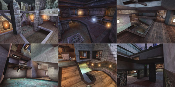
You can check out the pack here.
Plus they received amazing reviews. This was the main problem in my opinion. They received good reviews, touting their excellence. All of them. Other mappers went out and created similar style maps, many of which also received similar glowing reviews. These maps were setting the benchmark for maps to come in future iterations of the game.
The problem is they did not really work very well with the ut duel ruleset. Noone really played them all that much, especially not at a competition level when the game was super active. This is not because they were bad (they were never played enough to be called bad yet they reviewed well) but because there was heavy push back against third party content for duel, tdm and ctf. CTF eventually came around but by the 2k3 release duel had not changed. I had them put on our local duel servers (long live IPGN) and played them a bit, however because I was OP at the time and stomped most people I did not see the problems.
So we had this fairly significant set of maps that were rarely played / not played at a high level and were considered awesome. They influenced community mappers going forward into future titles. On top of this they influenced Epic mappers or community mappers that went on to work for/at Epic. 2k3 was released without duel maps. The maps we played were horrible. 2k4 was released and.. it had dm-1on1 maps. A fairly significant number of them too. Thats cool! I was really stoked for these as ut99 had dm maps we played duel on, 2k3 had horrible maps and 2k4 had maps specifically for duel! Yay. Upgrade. Epic noticing duel.
Surprise, surprise, they were similar to the ut99 community 1on1 maps in size and style. However because they shipped with the game this time around they actually got play time. And they were not good for duel. They were small, which in and of itself was not a crime but combined with weaponstay off they were very one sided and unplayable. Weaponstay adds a lot of depth and is one of the saving graces of ut duel, but maps need to be large enough for weapon stay to matter for the out of control player.
Here are the 2k4 maps.
DM-1on1-Albatross
DM-1on1-Crash
DM-1on1-Desolation
DM-1on1-Idoma
DM-1on1-Irondust
DM-1on1-Mixer (UT2003’s Epic BP)
DM-1on1-Roughinery
DM-1on1-Serpentine (UT2003)
DM-1on1-Spirit
DM-1on1-Squader
DM-1on1-Trite
I played them. I wanted to like them. There is only one in this list that worked and you all know which one it is. It just happens to be one of the larger maps from this list.
These maps shaped the future of ut duel from when they were released to today. They are not great and maps based on their style are only passably ok for duel. They tend to exacerbate the problems that ut duel has, rather than mask them like the older ut99 maps did.
And they shaped the world of unreal tournament custom maps in an irreparable way – all the way to ut4.
*Most discussion back then revolved around EU vs NA rules. Essentially belt vs no belt.